Brand Strategy
Brand Identity
Brand Positioning
Copywriting
Website Design + Build
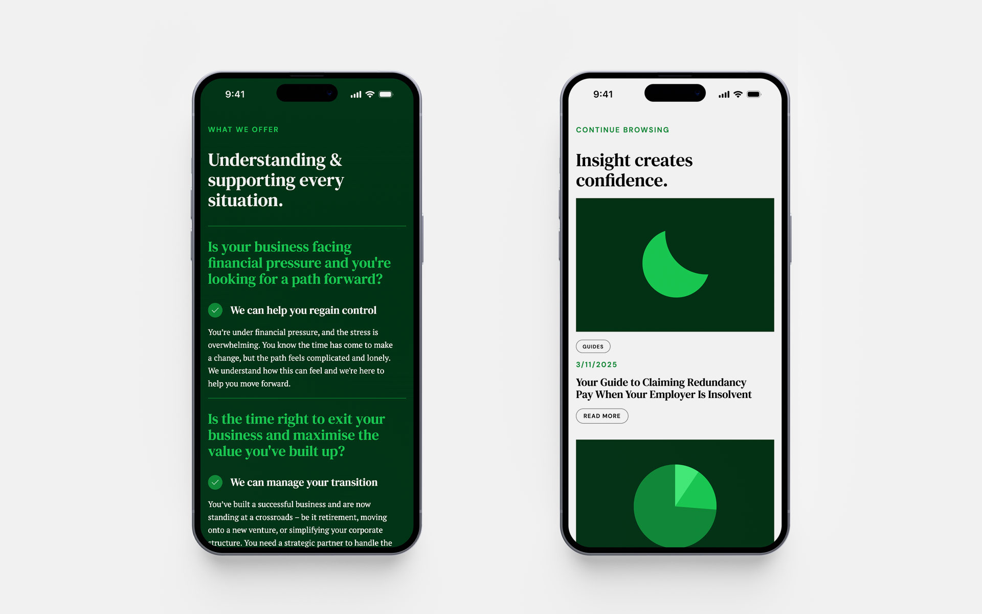
The insolvency industry is often defined by difficulty and distress, making it a challenging landscape for a brand to navigate, let alone promote. Certus, a dynamic startup IP company, came to us with a vision to do things differently. They wanted to break away from industry tropes and build a narrative rooted in positivity. Their goal was to move beyond the stigma of financial uncertainty and instead highlight the benefits of their supportive, expert service. They sought a partner to help them stand out and communicate a clear message: that financial distress does not have to define a business’s future.
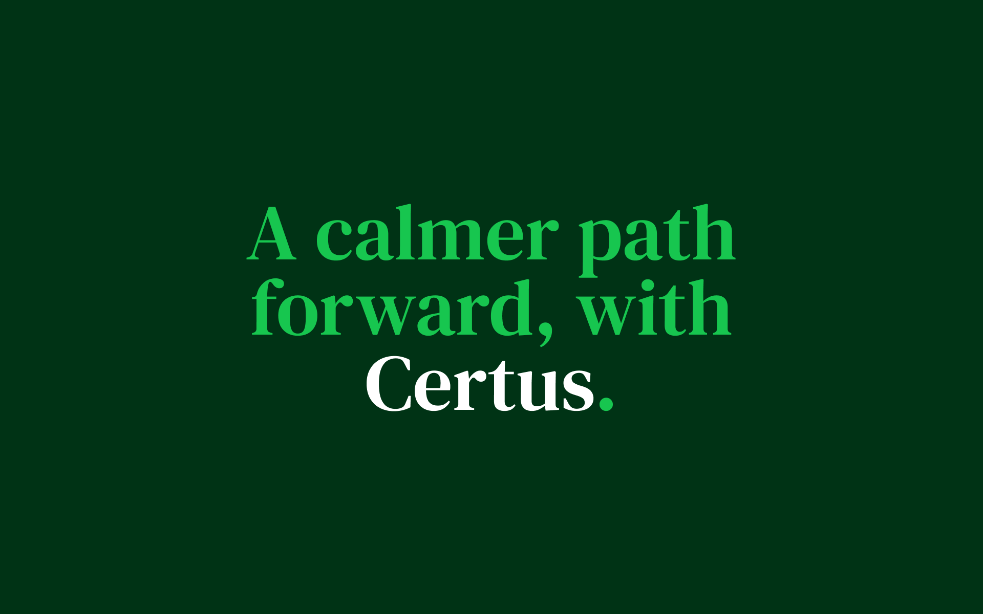
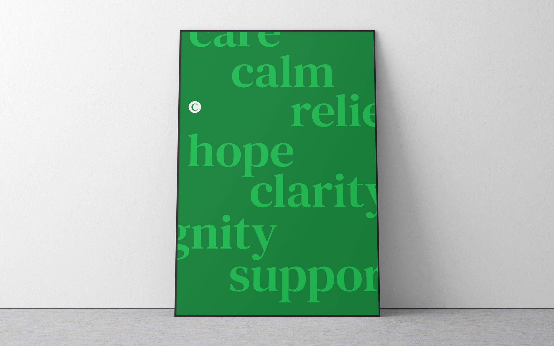
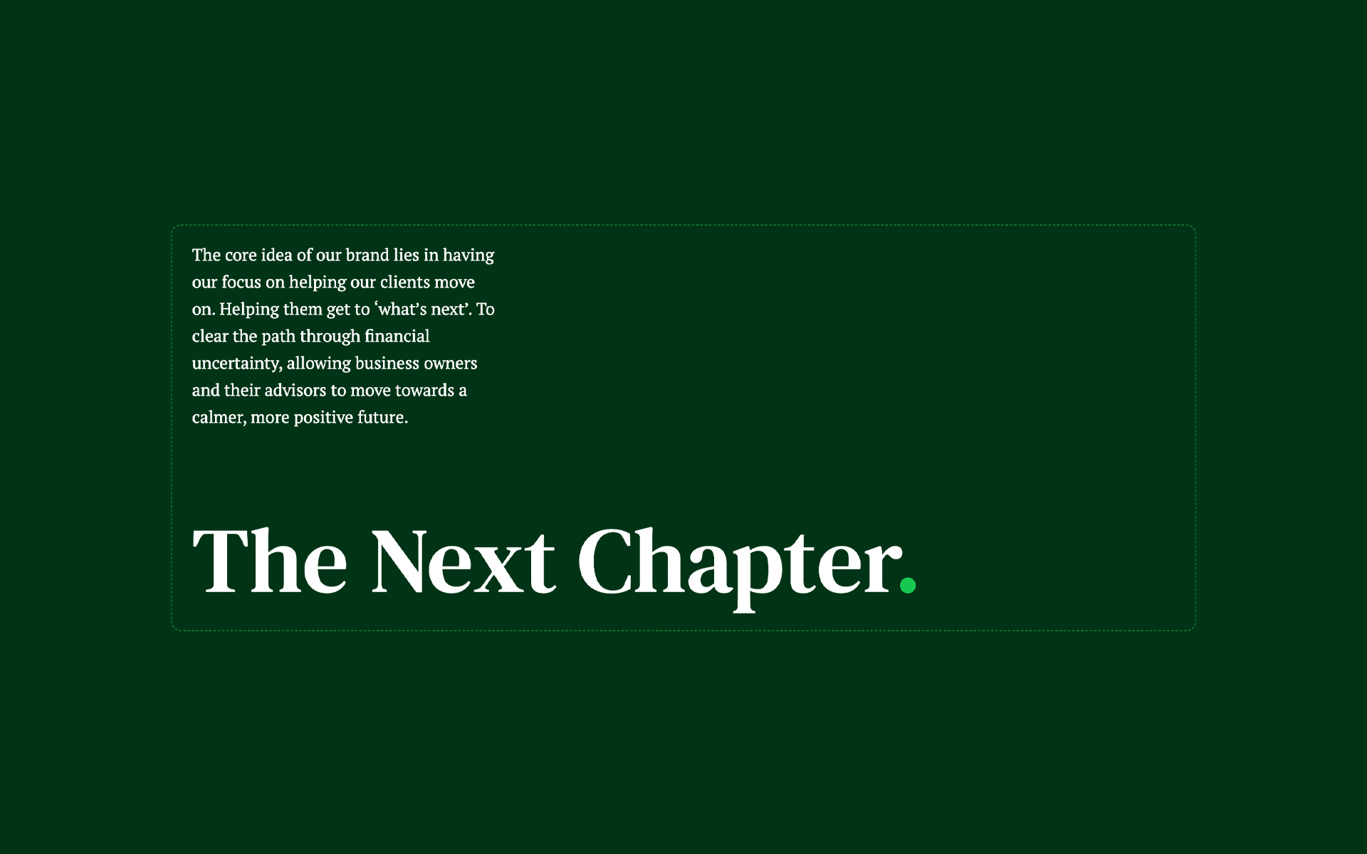
Through our collaborative process, we developed a core strategic idea: ‘The Next Chapter’. This concept reframes insolvency from an ending into a transition. It articulates Certus’s primary purpose: to clear the path through financial uncertainty, allowing business owners and their advisors to move towards a calmer, more positive future. We leaned into our belief in the power of clarity to communicate this complex shift effectively. By positioning insolvency as just one chapter in a larger story, we created a brand point-of-view that leads with humanity and promises a constructive approach.
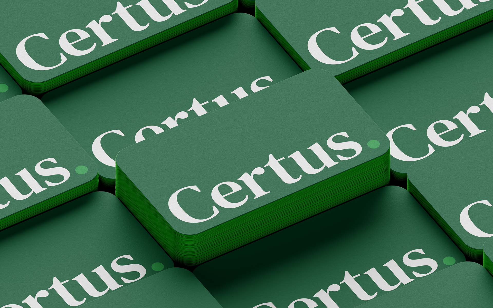
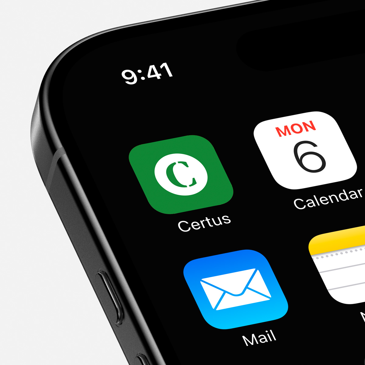
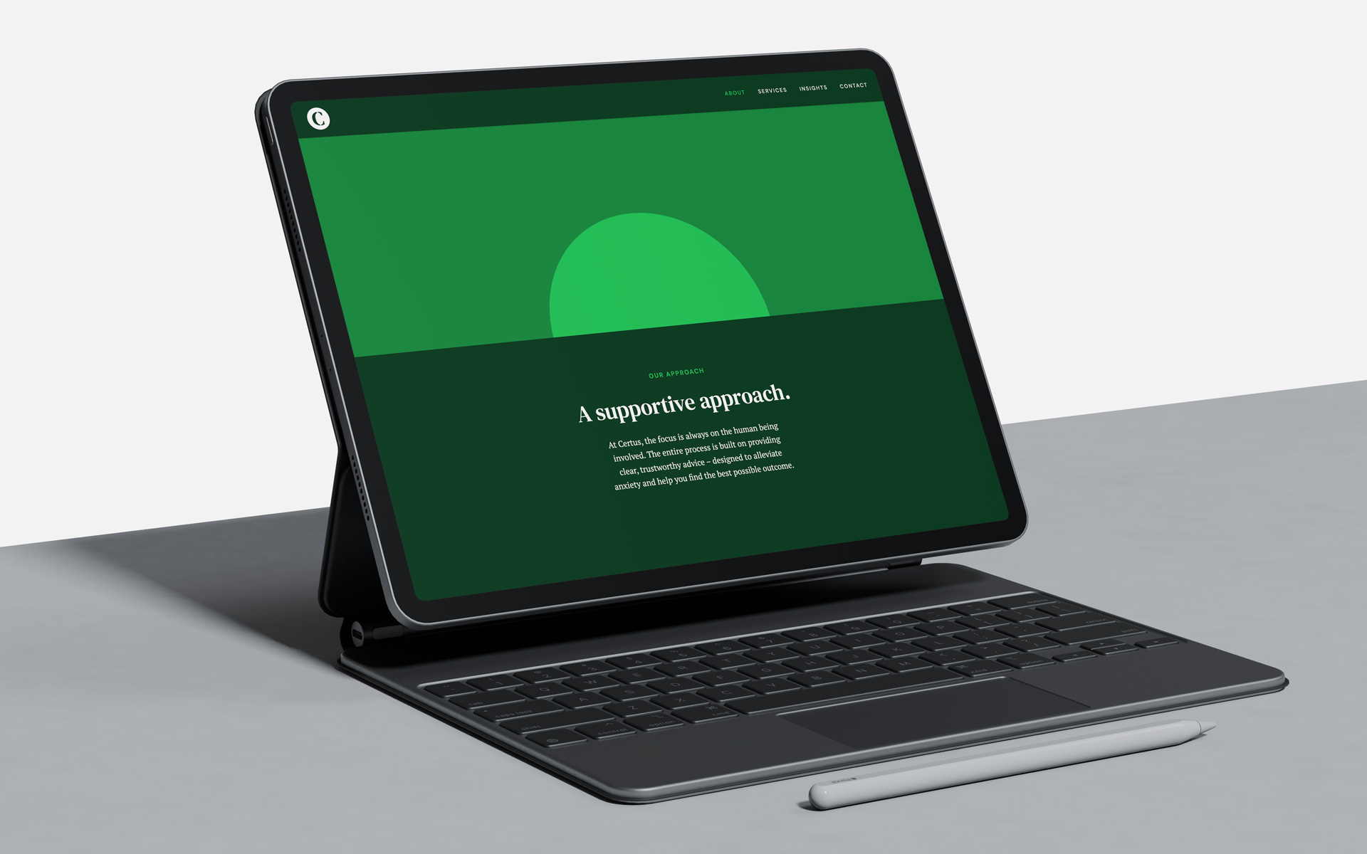
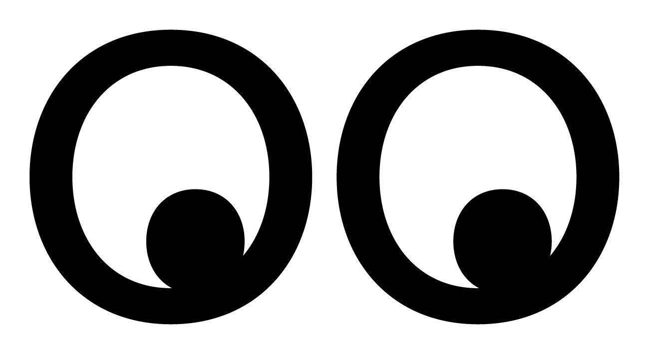
To bring ‘The Next Chapter’ to life visually, we rooted the brand identity in our modernist principles of simplicity and functionality. All imagery for the brand is derived from the ‘active dot’, the full stop at the end of the Certus logo. This simple yet powerful element represents completion, clarity, and the opportunity to move on. We also expanded the logo’s application into a bespoke ‘assurance style’ mark, reinforcing their expertise and commitment to compliance. This visual language, paired with a strategy of progress, ensures the brand feels cutting-edge while remaining approachable
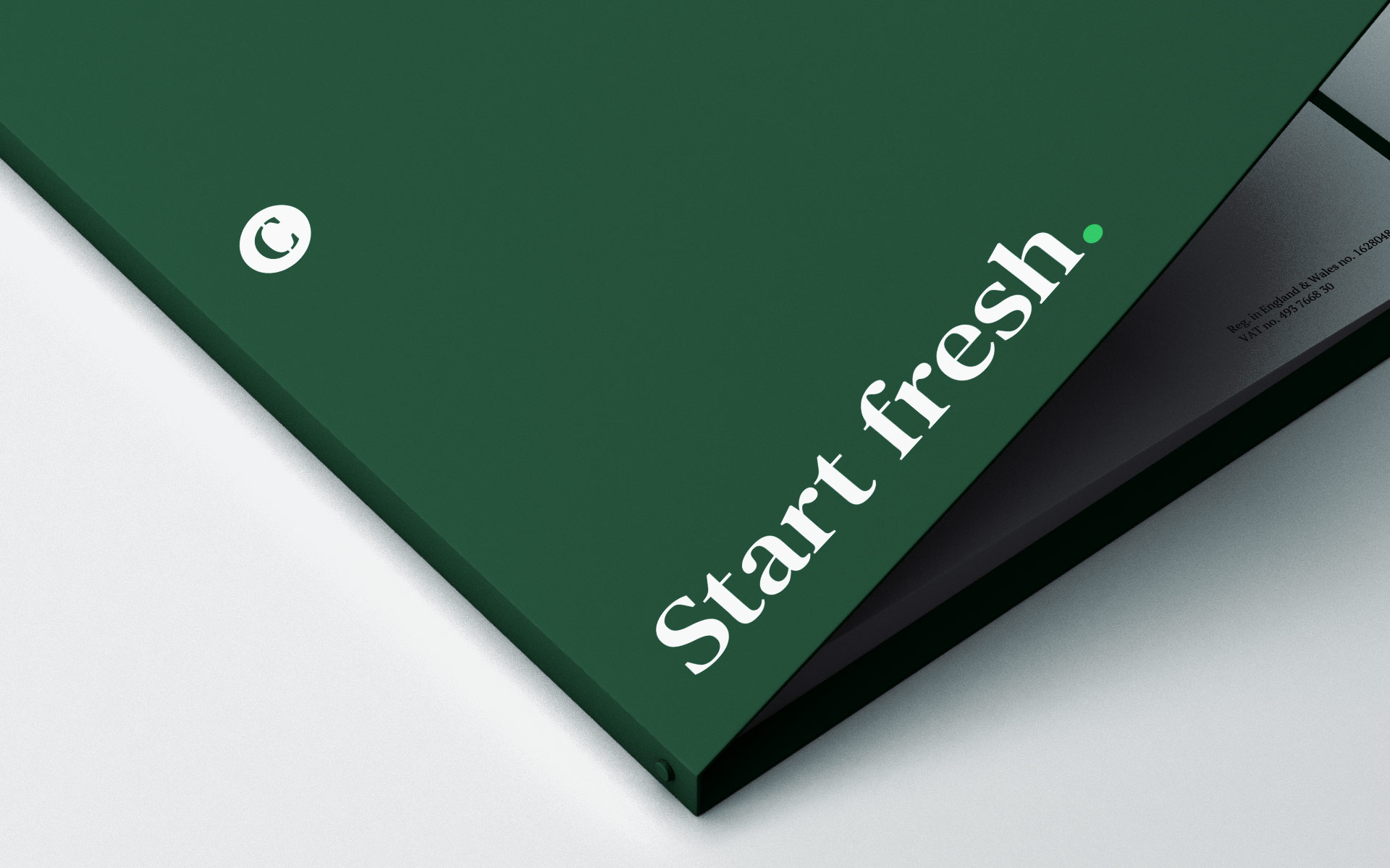
The result is an authentic brand experience that empowers Certus to create meaningful connections with their audience. By blending strategic thinking with creative ingenuity, we’ve equipped them with a suite of straplines – from “Create certainty” to “A clearer perspective” – that reinforce their role as a trusted guide. Certus now stands as a beacon of clarity in a complex field, providing their clients with the confidence to regain control and start fresh. It is a brand built to endure, proving that with the right perspective, every challenge is simply the beginning of what’s next.


Common Objective

Chroma

Earthblock

Stansons
We believe ideas have the power to change the world. Whether yours is a spark or a detailed plan, let's explore what's possible.
Message us